Hi there! I’m Maxime, and you’re reading Recreations, a (still desperately infrequent) newsletter about the intersection of media, technology, and culture.
If you’re haven’t subscribed, you can do it here or by clicking the button below.
Today, we’re exploring the physics of fun and casting away the curse of soulless interfaces.
Soulless interfaces
Lately I've been thinking about digital interfaces, and how our desire for them to be as sleek, fast, and intuitive as possible has left us with screens and apps that all look and feel the same. "Frictionless" to the extreme, the interfaces we use on a daily basis have lost their soul.
Same fonts, layouts, and color codes. It's something like the digital equivalent to the rise of blands - the army of pastel-looking, sans serif-using brands all drawing on the same identikit. The same way DTC companies adopted a single, acceptable aesthetic, digital products have converged into a dull lowest common denominator.
In some instances, you'd be hard-pressed to distinguish between multiple services. So strong is the digital mimetism that slight differences between icons or the name and position of a menu are virtually the only cues as to who built an app. It doesn't matter who was first; once every product follows the same formula, design seniority is forever lost on the user.

This race to sameness feels incredibly misguided. Aesthetics can be a powerful differentiator in crowded markets, and sacrificing visual uniqueness for the sake of familiarity means forgoing perhaps the most direct way to enchant your users. As I previously argued about Spitfire Audio, design is a storytelling tool, and having a distinct look and feel is all the more important that you're aiming for repeat usage.
This lesson should apply to all consumer-focused software - if not to all software, period. As Marc Geffen noted in Commercial Artware:
Branding is increasingly a function of UX/UI. In a world of attention warfare, saturated by messaging, brands need to supply fluidity and experiential novelty in order to cut through [...] Beyond the core product, much of a brand’s aesthetic, vibe, and meaning used to come from its logo and graphic design and ad copy; now we assess those qualities by judging the brand’s sensibilities around human-computer interaction.
We expect more from the products we use than sleekness or nice gradients. What we want is surprise, delight, and fun.
"Judicious expressiveness" and sensory delight
As it happens, those are staging a comeback. Two trends should give us hope: skeuomorphism, and its hype little cousin, spatial software. I'll discuss them in turn.
Skeuomorphism
Skeuomorphism is a style of design that uses ornamental cues to emulate original objects or materials. One example from the physical world could be electric light bulbs shaped like candle flames; in the digital realm, think Microsoft Word's "Save" button (the infamous floppy disk), or Gmail's now disused logo.
Skeuomorphism is perhaps best defined in contrast with flat design. While flat design favors minimalist interfaces, skeuomorphic design postulates that additional visual cues can help point users to an object's or interface's function - what's called affordance in the design lingo. To do that, it draws from real life, using variables such as lighting, texture, and depth to suggest an item's "action possibilities."
Since a picture is worth a thousand words, here's a great example from designer Adrien Olczac. On the left, skeuomorphic design (🤩); on the right, flat design (🥱).

Credits: Adrien Olczac
The reason why skeuomorphic design feels so different from what we're used to today is because it was brutally pushed to the background in 2013 with the introduction of iOS 7. As Michael Flarup recalls:
iOS 7, with its minimalist UI, white space layouts, and magazine typesetting, represented a shift in the role that visual design had to fulfil. Under the rule of minimalism, visual design for the sake of design took a backseat. A successful interface was one that visually didn’t call attention to itself. The fewer visual embellishments an interface had, the more effective and clean it was considered. As little interface as possible, was the best interface.
It's hard to overstate the impact this had. Apple’s sway over design through iOS was already so strong that flat design spread like wildfire. In no time, digital minimalism had taken over.
And now, Apple is bringing dimensionality back.
At WWDC20 in June, Apple announced Big Sur, which includes a major revamp of the macOS user interface - Craig Federighi, Apple’s senior vice president of Software Engineering, called it the company's "biggest update to design in more than a decade." Among other changes, Big Sur's icons incorporate perspective and shadow to make things look more lifelike.

Credits: Apple
As others have observed, Big Sur's revamp isn't a return to straight-up skeuomorphism. Standing somewhere between the skeuomorphic and flat paradigms, it's neumorphic: a design middle ground that focuses not so much on imitating textures, but rather "on how light moves in three-dimensional space." In its Human Interface Guidelines, Apple suggests the goal is "judicious expressiveness."
Clearly, not everyone is happy about it — just read the comments here. But I think this marks a step in the right direction.
I've long been convinced flat design has had its time, so I'm excited to see even the tiniest move away from it. That this move is coming from Apple, which so greatly contributed to the demise of skeuomorphism, makes me all the more hopeful, because control of the OS layer essentially makes the company a design legislator. I'm hoping developers take things up a notch with dimensionality in a near future.
Spatial software
Skeuomorphism walked so spatial software could run.
While skeuomorphic design most of the time only applies to static elements like icons, backgrounds, and screens, spatial software takes dimensionality a step further, replicating not just how things look, but how they work. It builds upon our understanding of the world and how elements within it are supposed to react to one another and to their surroundings.
In two must-read essays, John C. Palmer covered a number of use cases that benefit - or could benefit - from spatiality, from calendars to video conferencing, to messaging, conferences, and web browsing. The past few months have only confirmed these intuitions, with examples ranging from Microsoft's Together Mode, to apps like Clubhouse and Roadtrip that rely on shared "rooms." The "internet as a place" discourse is having a moment.

Credits: Microsoft.
At a deeper level, spatial software summons up our most intuitive sense of space, by replicating kinetic models we can recognize and, more importantly, adhere to. As Pasquale D'Silva put it:
The best sofware we can make is an extension of the humain brain. [...] It's designed for human beings that live in the dimensions of space and time.
When applied to digital interactions, accurate kinetic models thus help us think beyond the boundaries of the screen: they let us infer a broader environment than what's visible at a given moment. With them, the button you tap has an origin; the card you swipe away, a destination. They make software spatially, and rationally, grounded.
Some deem most of this unnecessary. For many a designer, interfaces shouldn't burden the user, or themselves, with information that doesn't serve a clear purpose on screen. To them, skeuomorphism, by adding visual complexity, already represents an unneeded cognitive load; it's only logical that spatial software — in many ways a supercharged instance of skeuomorphic design — would be judged even more harshly.
It's a risk worth taking. For one, I think spatial software speaks to some core needs that somehow were never properly addressed, or even acknowledged, by flat interfaces. That we crave dimensionality at a time when our daily lives have been flattened into a never-ending Zoom meeting is significant.
But more importantly — it's just fun. There's a sense of sheer wonder that stems from bridging your analog and digital environments, from being able to grasp them using the same rules. That spatial software might seem uncalled for makes it all the more valuable — not everything always has to "make sense," or "remove friction." Spatiality can make a little complexity delightful.
Case studies
Here, I'd like to emphasize three companies that have done a great job at turning sensory imput into delightful design experiences.
Anchor: Likes you can hear
Anchor is "an all-in-one platform where you can create, distribute, and monetize your podcast from any device, for free". Founded in 2015, the company was acquired by Spotify along with Gimlet Media in February last year, in what marked Spotify's first move towards its audio-first future.
Anchor being "all-in-one," you used to be able to listen to podcasts from inside the app. That all changed after the acquisition, as Spotify was intent on capturing that part of the value chain. While Anchor still enables one-click distribution, the actual listening now happens on Spotify — or whatever app you're using to access your favorite content these days.
Back when it was still a listening app, however, Anchor introduced Applause, a neat feature that let you "clap" while listening to podcasts. Here's how the company described it at launch:
👏 Applause: a Like you can actually hear Anytime you hear something you love, gently knock on the back of your phone a few times while it’s in your pocket to applaud the host (or you can tap the applause button if you’re looking at your phone). It’s a lot of fun.
And it was a lot of fun. Every knock or tap would trigger a clapping sound and send a bunch of emoji falling over the screen - an audiovisual manifestation of your excitement.
Compared to the flat Applause button, the knock-on-your-phone trigger was a formally far superior experience. The simple act of tapping your phone helped reconnect your digital and physical environments. As a result, applauding on Anchor felt tangible — it had a real-world origin (the tap), and a multisensory digital impact (the sounds, the falling emoji).
Zenly: A sense of space
Zenly is a social mobile map that lets you see what your friends and family are up to. If this sounds familiar, that's normal: after Zenly was acquired by Snap (still Snapchat at the time) in 2017, its location-sharing tech became the building block of Snap Map, now one of Snapchat's signature features. (Snap Map actually debuted before the acquisition was made official.)
As a social map, Zenly's whole focus is to give you a sense of space: to help you know, literaly, where you stand in the world, how far or close your friends and family are, and where they're going.
This shines through across the entire experience. The app opens on a map centered on your location; as you zoom in and out, your friends start to appear one by one as map pins. Swiping lets you jump from one pin, or indeed, one friend to the next to check (or spy) on everyone at a glance. Every action closes the distance between you and your loved ones and shrinks the world to a scale that feels personal and manageable.
Spatiality permeates every aspect of Zenly's design, adding both literal and figurative depth to your experience. Send your friends some emojis and they'll flock to them on the map; if you find yourself on the receiving end, they'll appear on your screen like they're flying to your face - with some unexpected consequences:
3 regular 💩 emojis to a friend will result in a giant 💩 covering their whole chat screen. It sticks to the screen and can only be removed by wiping it away 😂!
The app uses every screen as an opportunity to enrich your virtual journey with new dimensions. Most often than not, this is done through a combination of things, including visual depth, sound, haptic feedback, or the gyrometer.

Its website follows the same principles.
On the main page, you're welcomed with a giant globe, rich with the company's vibrant colors and fun graphics. As you spin it, 3D pins pop up that represent people's locations on the planet, like they do on the app.
Scrolling down takes you on a journey through a series of CGI scenes, each of them rotating as you move your mouse, and filled with a myriad of details - trees swaying, flags waving. A combination of hover effects has every menu, button, and section floating, waving, popping, and bouncing.
All these interactions aren't gratuitous: they embody Zenly's product and mission, make them dynamic, interactive, and almost palpable. They're proof that Zenly is all about movement.
Panic: Analog delight
Panic is a software developer known for its quality macOS and iOS apps, and an indie game publisher.
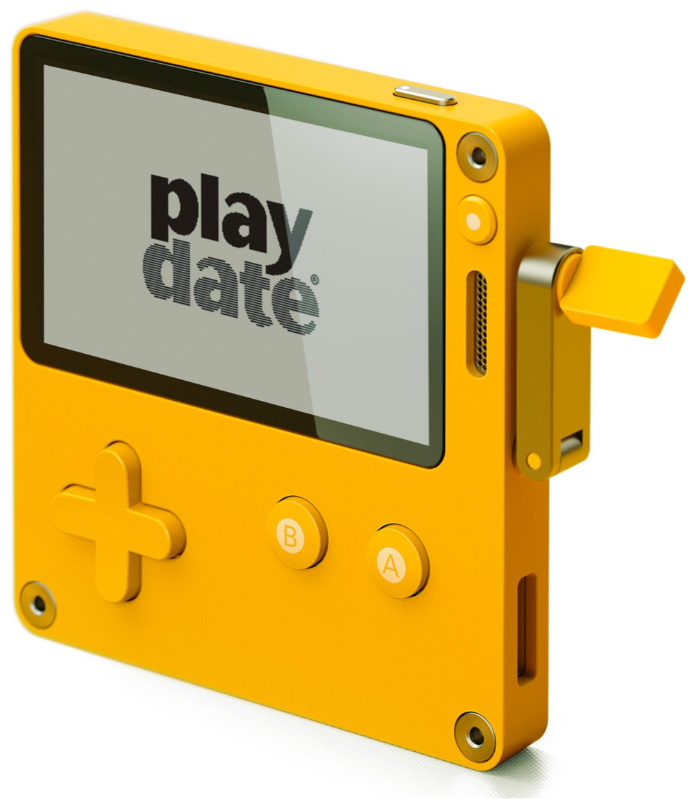
As of last year, it's also a game console manufacturer. In May 2019, Panic announced Playdate, a gaming device designed in collaboration with Sweden's Teenage Engineering.
In the Switch and fablet era, Playdate is a bit of an oddity: it features a 400x240 pixel, black-and-white, non-backlit, 1-bit screen; a directional pad; two buttons; and... a mechanical crank on the right edge of the device. The result looks like a mix between the upper part of a yellow Game Boy Pocket and a coffee grinder.
Introducing the Playdate Gaming System

Credits: Panic.
Here's what Greg Maletic, Panic's Director of Special Projects, said about the device at the time:
We knew we needed something different to make this device feel different people to people. [...] The crank provided us with just enough weirdness and just enough differentness to make this interesting.
Unlike the one you'd find on, say, a hand-crank flashlight, Playdate's crank doesn't power the device: it controls it, letting you interact with games in ways a push of a button wouldn't. In a recent thread, Panic provided multiple examples of how indie developers are using it to come up with novel mechanics, from moving through time, to setting the direction of a calligraphy brush, to firing a chaingun.
More than a charming feature, Playdate's crank embodies Panic's ambitions for the whole project. Starting from scratch, the company was willing to experiment right away on the hardware side. For developers, the crank was an open invitation to design compelling mechanics. For players, it introduced a more direct connection to what's happening on-screen.
This made the crank an entry point into the play experience - a move reminiscent of Nintendo's playful approach to controllers, examplified by the Labo kits. With Playdate, the hardware itself is part of the delight; it enables it. And the more closely the crank's movement parallels the action on-screen, the more magical it feels in your hands. This level of granular control — like you're physically manipulating a microcosm — fosters a sense of wonder.
Coming to our senses
These examples are proof that things don't need to be complicated. In fact, so great is our craving for digital delight that a few well-thought interactions here and there could do the trick — it's like all we need is a little haptic feedback. Is that really too much to ask?
If you're designing and building for consumers, please keep this in mind. It’s OK for your app to have a little “friction,” or to have features that are a little out there, or don’t generate the highest levels of engagement.
To quote Michael Flarup's timeless advice:
[...] design can be anything we want it to be. We should strive to make fun and memorable experiences that are appropriate to the context, but not arbitrarily restricted. [...] Allow ourselves to embellish in the name of orchestrating an experience. Delight as a differentiating factor.
The Medley
I’ve been obsessed with this series ever since it debuted some five years ago. That I painfully watched its first season while on a month-long, Soylent-only diet (a stupid bet) made me love it all the more. The new season, which focuses on BBQ, tied nicely with what remains my favorite episode to date.
Behind the scenes of book cover design | An interview of Janet Hansen by Tobias van Schneider
It’s a known fact that Tech Twitter loves Stripe Press — not so much for the ideas it promotes, which I rarely see anything about, but rather for its design. This interview is an inspiring look at the craft and many compromises that go into designing book covers: “ultimately a book is a product and its cover is an advertisement.”
Oda is a new take on what it means to listen to music at home. It brings together a set of speakers designed specifically for live music and a series of exclusive live performances meant to be consumed as "seasons." I shared some thoughts about the product in this thread.
Thanks for reading. If you found this issue valuable, I’d really appreciate it if you could forward it to a friend, or share it with the world.
As always, I’d love to hear your thoughts about this essay, or really anything that’s on your mind! You can find me on Twitter - or just reply to this email.